




















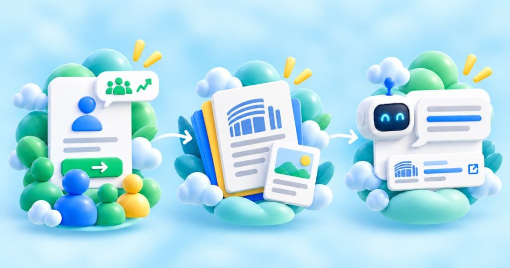
In 2027, association website design has three jobs: recruit members, carry your advocacy, and be easy for people and AI to find and cite. A brochure site that lists committees and a mission statement does none of them. The association websites that work are built as one hub where prospective members see the value and join, where policymakers and ambassadors find the asks, and where every campaign asset lives so it can be reused and quoted.
This guide is for the communications or membership manager who needs a partner to make that hub and the content inside it. It covers what an association website must do for each audience, how to use it as the home for your content, and how to make it the source an AI engine cites when someone asks about your sector.
Key Takeaways
- Membership is now discretionary. Only 38% of associations reported growth in the latest benchmarking, and 39% of non-joiners said they did not know the association existed (Sequence Consulting, 2027 Association Trends). The site has to prove value and be found, not just inform.
- The website is a conversion, advocacy and authority platform, not a brochure. Its job is to make the value obvious, make joining and acting frictionless, and make your expertise easy to cite.
- It serves several audiences at once: prospective members, current members, policymakers, campaign ambassadors, and press. Each needs a different path through the same site.
- Make it the home for your content. The position papers, videos and infographics from your campaigns should live here, so one link does the work and nothing is made to sit in an inbox.
- A flagship campaign often needs its own microsite and mini-brand, on a separate domain linked to the main site, built to grow as supporters, media and events are added without a rebuild.
- Build it to be cited by AI. By 2027, members and policymakers often meet your association through an answer in ChatGPT, Perplexity or Claude first, so the site has to be structured for a machine to quote cleanly, and kept that way after launch.
Why the brochure site fails in 2027
Associations used to be able to assume members would renew and prospects would find them. That assumption is gone. In the latest benchmarking, only 38% of associations reported membership growth, 39% of non-joiners said they did not know the association existed, and 28% could not see the return (Sequence Consulting, 2027 Association Trends). Discoverability, proof of value and a low-friction join path are now primary website requirements, not marketing extras.
The upside is real when the site works. Trade associations keep 82% of first-year members, against 61% for individual-membership organisations (Sequence Consulting, 2027). The website is where that first year is won or lost: it is where a prospect decides the value is obvious, and where a new member finds enough to come back.
What association website design must do
An association website earns its place by doing a few specific jobs well, and each one needs content behind it, not just a page.
| Job | What the site must do | The content it needs |
|---|---|---|
| Recruit members | Sell specific outcomes, segment the offer by company size or role, and remove friction from joining | A clear value page, proof, a simple join path, a short explainer video |
| Carry advocacy | Turn policy positions into something a policymaker or ambassador can act on | The campaign hub, position papers, briefings, data visuals, a clear contact route |
| Build authority | Make the association the cited source on its sector, for people and AI | Original data, clear explainers, named expertise, a plain FAQ |
| Keep members | Give members a reason to return and material they can use | Member resources, toolkits, updates, assets members can share as their own |
What each audience needs from the site
The same site is read by several audiences, and each one wants a different path. Design for all of them, including the campaign ambassadors who carry your message in public, not just members and officials.
| Audience | What they need from the site |
|---|---|
| Prospective members | The value in one line, proof it pays back, and a join path with no friction |
| Current members | Resources, updates and ready-made assets they can use and share |
| Policymakers and their staff | The asks and the evidence, fast, with a clear route to a named contact |
| Campaign ambassadors | A toolkit to carry publicly: talking points, a slide, shareable assets, a short video |
| Press and public | A clear story, a quotable line, a hero visual, and the hub link |
Make it the home for your content
A campaign produces a position paper, a video, an infographic. Too often each one lives in an email or a one-off PDF and is used once. The association website is where that stops. Build the site as the hub where every campaign asset lives, so one link is the thing you give a member, a journalist or an MEP, and so each asset can be reused rather than remade.
This is the same discipline behind running advocacy campaign content: plan the use first, make assets to be reused, and give them one home. A website built this way turns a series of separate campaigns into a growing library that keeps working.
A good content partner structures that home before a word is written: a sitemap, a section outline, headings and suggested lengths. You then populate it with your approved messaging. You own the words; the partner makes them work as a site, so the content and the build move together instead of waiting on each other.
When a campaign needs its own microsite
Not every initiative belongs on the main association site. A flagship campaign often works better as its own microsite with a distinct mini-brand, on a separate domain linked back to the association, so it carries its own identity while staying clearly connected through the name, the navigation and the links. A separate site is also simpler to maintain, permission and hand over later.
Whichever route you take, build it to grow. On an advocacy site the strongest visual element is usually the supporters and ambassadors, shown with names, logos, quotes, photos and short testimonial videos, and that gallery should expand as more sign on, without a structural rebuild. Plan the same for media and events: new supporter videos, event photography and campaign visuals get added after launch, and a flagship event should get prominent visibility across the site. A campaign site is a living thing, not a launch-day artifact.
Built to be found and cited by AI
By 2027, a prospective member or a policymaker often meets your association through an AI answer before they ever reach your homepage. When someone asks ChatGPT, Perplexity or Claude who represents an industry, or what the sector’s position is, you want the association to be the cited source.
That is a design and content job, not a plugin. It means clear statements of who the association is and what it stands for, original data and explainers an AI cannot get elsewhere, and a plain structure with direct answers and an FAQ a model can lift cleanly. The same work that makes the site easy for a busy official to skim makes it easy for an AI to quote.
Treat this as ongoing, not a one-time setup. The build follows these principles, but AI visibility is won after launch too, through regular content updates and monitoring of how ChatGPT, Perplexity, Gemini and Claude answer questions about your sector. A site that was citable at launch and never touched again slips as the models and the debate move.
Which do you need: a refresh or a rebuild?
Not every association needs a new website. If the structure is sound and the content is current, a refresh that sharpens the value page, adds the campaign hub and makes the site citable can do most of the work for a fraction of the cost. A rebuild earns its place when the site cannot carry the join path, the advocacy hub or the content, or when the brand no longer fits the association.
Decide by the jobs above. If the site cannot recruit, carry advocacy and be found, fix the gap. If it can, invest the budget in the content that fills it.
Proof
We built the brand and the website for European Metals’ EU advocacy campaign, designed as a hub that members, the advocacy committee and allies could all draw from, and carried to MEPs and trade unions. The site was made to hold and reuse the campaign’s content, not to sit as a brochure. See the European Metals EU advocacy campaign.
We make this work from our studios in Madrid and Bogotá: websites, branding, video, animation and the content an association’s site needs to recruit and advocate. For the wider picture, see our guide to choosing a creative agency for nonprofits, associations and NGOs.
Frequently asked questions
What should an association website do?
How does an association website recruit members?
How does the website support advocacy?
How do you make an association website get cited by AI?
Should a campaign have its own website or sit on the association’s site?
Should an association refresh or rebuild its website?
Are you the communications or membership manager who needs an association website that recruits and advocates, built by a partner who also makes the content? Tell us your audiences and your asks, and we will build the hub and the assets that fill it.